Optimal Eco
Credits

Making three services sound like three services
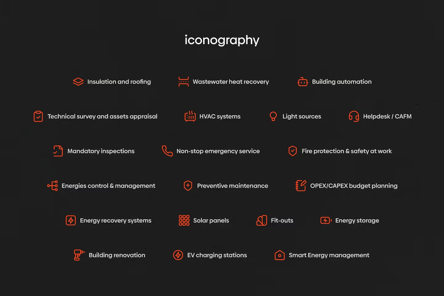
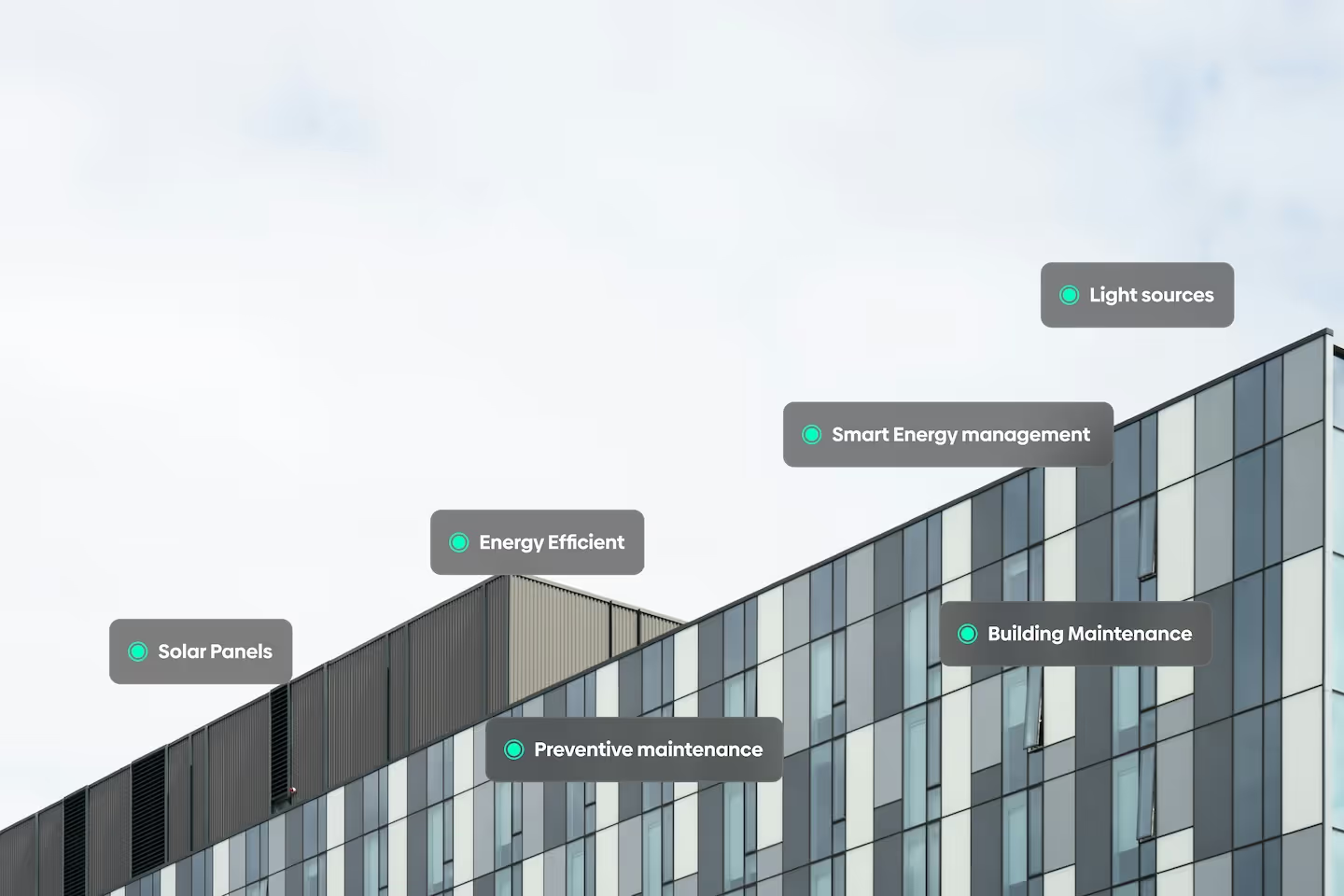
Optimal.eco helps large buildings use less energy — offices, warehouses, logistics sites, apartment blocks. They're based in Prague and they do it three ways: replacing outdated heating, ventilation and lighting with efficient equipment; running buildings day to day so they stay efficient and compliant; and installing new kit like solar panels and frequency inverters.
Fix what's there, run it well, add what's missing. Simple enough once someone says it that way.
Their problem was that on paper all three read as the same thing. Every service began with "Energy Efficiency," every description reached for the same vocabulary — consumption, carbon, ESG — and a facility manager skimming the page would come away knowing Optimal.eco did something about energy without any sense of which service to ask for.
The second problem is that this is a genuinely unglamorous industry. Nobody's heart rate rises at frequency inverters. But the buyers are practical people spending real money, and they don't need excitement. They need to understand what's on offer within about ten seconds.
Romain Andreoli
Simon is a straight to the point and efficient professional. He is doing everything possible to clearly explain his views and make everything easily understandable. He communicates accurately and is very open to comments and ideas.
One page, done properly
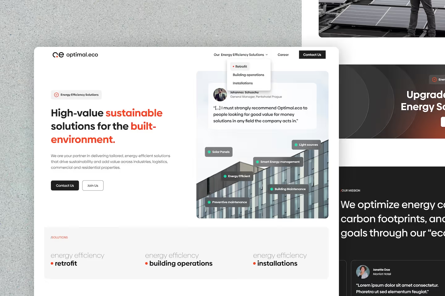
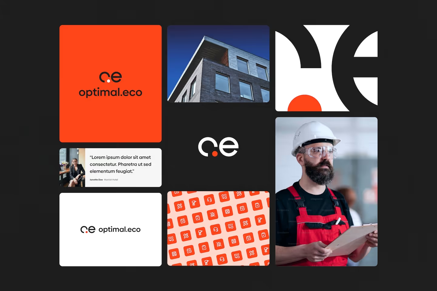
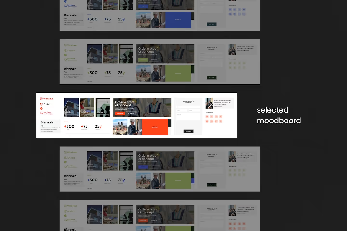
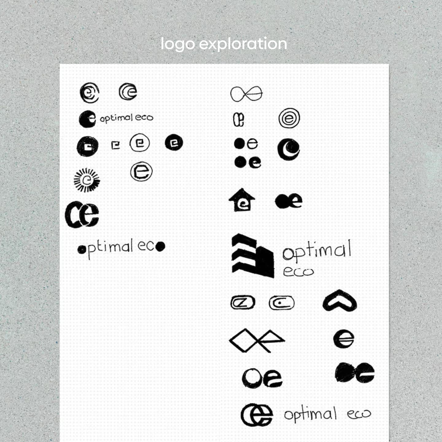
I handled all of it: brand and logo, web design, and the Webflow build.
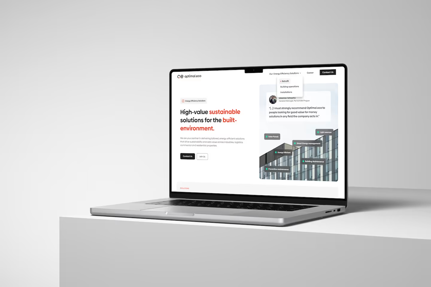
The site is a single page, which was the right call for a company at this stage — a five-page site would have meant four pages of padding. That constraint set the whole structure. Each service gets its own block with a concrete promise attached: what gets replaced, what gets managed, what gets installed. The overlap between them disappears the moment you say what each one physically does.
The other thing I wanted foregrounded was their eco² commitment. It's easy to read that as a sustainability badge, but their own framing ties it to something better — turning projects into long-term partnerships rather than one-off installations. For a client choosing between contractors, that's a more persuasive promise than a carbon figure.
Where it landed
A brand, a logo and a site that says what the company does without a facility manager needing to decode it. The client was open to the design direction throughout and the collaboration ran cleanly, which is most of why a one-person, one-page project came out coherent.
My role & tools
Branding, logo design, web design and Webflow development — the whole project, solo. Figma and Webflow.