
Pletor AI

Webflow
Motion

Credits

Simon
Quentin Chuzeville
Sophie Jean-Paul

Project overview

Pletor is a Paris-based startup building AI creative infrastructure for marketing and creative teams: a production environment that orchestrates the best image, video, and text models (Flux, Kling, GPT Image, Veo, and others) around a brand's own context, so teams can generate on-brand content at scale instead of prompt-hopping between tools. After closing a seed round and shipping their first product, the team needed a new Webflow website that could carry that positioning: less "AI prompt box," more serious production infrastructure for enterprise creative teams. I worked with Pletor's product and design lead, Quentin Chuzeville, and co-founder Maxime Fonsale, to design the system and build the site in Webflow.

Context & challenges

Pletor's original site had been put together quickly around the funding announcement, when the product was still a single "build your own AI agent" tool. By the time we started, the product had grown into a full platform with distinct use cases: product imagery, performance ads, AI-generated UGC, and creative operations at scale. The old site couldn't hold that story. It didn't communicate the depth of the platform, didn't feel credible to the enterprise buyers Pletor was starting to court, and wasn't built to grow as new use cases, testimonials, and model integrations kept shipping.

The brief was also a technical one. The team wanted a site rich in motion and visual texture, glassmorphic hero graphics, layered product visuals, background video, without it feeling like a typical startup landing page. That meant balancing an ambitious visual direction against a CMS structure the team could keep updating themselves.

Approach & process

We started from Quentin's Figma work, which laid out the page architecture and the direction for each section: the hero, the "build creative systems" narrative, the four use-case blocks, the testimonial wall, and the FAQ. From there, my job was to turn that direction into a living design system in Webflow rather than a one-off page.

Visual design

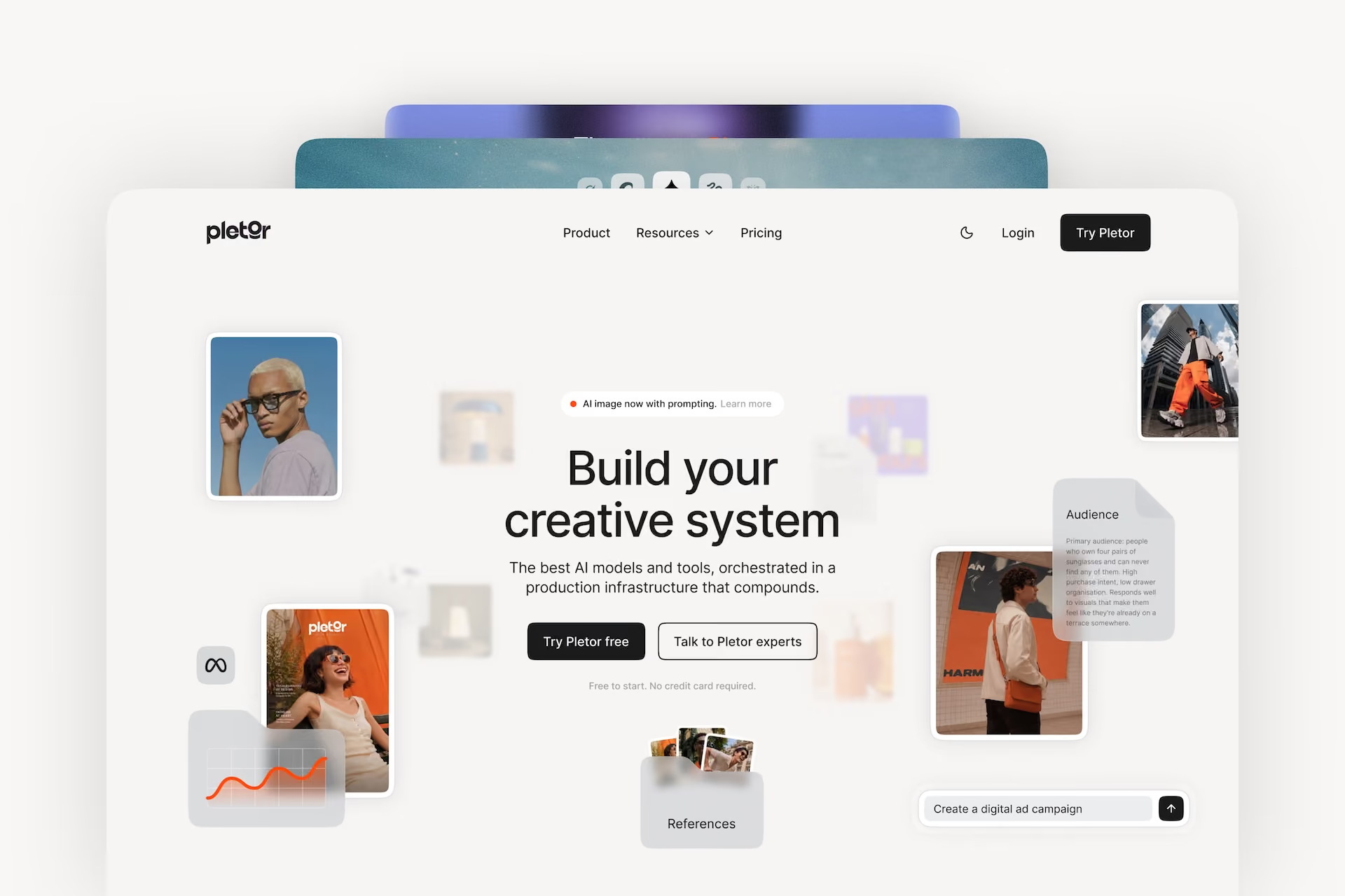
The visual language leans on depth and material: glassmorphic panels, layered product imagery, and a hero built to feel like an infinite creative canvas rather than a static screenshot. I kept the interface elements restrained so the AI-generated visuals, the actual product output, stayed the focus, which was the more convincing argument for a platform that says it produces "systems, not sessions." To show, not just describe, how the product works, I designed and animated three product videos in Jitter, walking through the core use cases directly on the page instead of relying on static screenshots or copy alone.

Webflow development & technical implementation

I built the page as a set of reusable, CMS-driven components rather than hard-coded sections, so the four product use cases (product imagery, performance ads, AI UGC, creative ops), the testimonial wall, and the FAQ can all be extended without touching the underlying layout. Background video was served through a CDN pipeline rather than native Webflow assets, and hero graphics were structured so repeated visual elements load once instead of duplicating requests across the page, both decisions made early to keep the page light despite its visual ambition.

Collaboration & workflow

We worked in short iterative loops: Quentin shared design increments, I built and reviewed them together on quick calls, and we adjusted before moving to the next section. Early on I shared a reference reel of animation and interaction patterns from my own portfolio, which became a shared vocabulary for the kind of motion we wanted, confident and premium rather than decorative.

Key features & highlights

  • Modular CMS structure for use-case pages (product imagery, performance ads, AI UGC, creative ops), so new offerings can be added without a rebuild
  • Glassmorphic hero system with product visuals treated as the hero content, not illustration
  • Three custom product videos, motion-designed in Jitter, showing the platform in action across its core use cases
  • CDN-served background video architecture built for smooth scroll performance
  • Reusable testimonial and FAQ components ready for ongoing content updates
  • A design system built to support Pletor's growing model roster and use-case roadmap, not just the launch state

Results & impact

The new site gave Pletor a website that matches where the product actually is: a production platform trusted by enterprise creative teams, not a single-feature launch tool. For the team, the bigger win was structural. The CMS-driven build meant Quentin and the team could keep publishing new use cases, testimonials, and product updates themselves, without needing a developer for every content change. The collaboration also set up a working rhythm, short iterative rounds between design and Webflow build, that carried into ongoing work together after launch.

My role & tools

I owned the Webflow build, design system, and CMS architecture, working from Figma designs led by Quentin Chuzeville, in collaboration with Quentin and co-founder Maxime Fonsale at Pletor. Sophie worked on the audit and optimization of the homepage and assets during the performance work phase (alongside the mobile speed fixes, image/video compression, and GSAP work).
Tools: Webflow and Figma.

Simon De Ridder

Web Designer & Webflow Expert
Webflow Certified Partner

Partner with a Webflow Expert

20+

client projects

5 years

experience building sites

15+

happy clients

Other Projects

Scalerrs
Web Design
Motion
Webflow
dConstruct AI
Web Design
Webflow